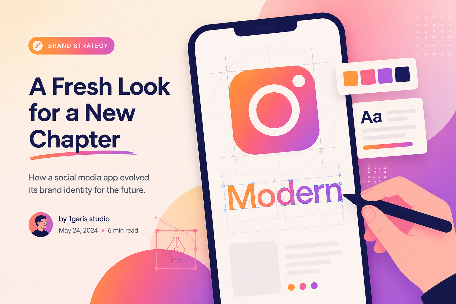
On 13 August 2026, Instagram changed the handwritten name at the top of its app for the first time in a decade. The gradient camera icon on a phone home screen stayed put. The lettering did not. Within hours, one complaint travelled farther than the design rationale: some people thought the new “r” made the name look like “Instagzam.”
That joke is easy to dismiss as the routine noise around a logo launch. It is also a useful reminder for a small business. A logo is never seen only as a design file. Customers meet it in a profile photo, a tiny browser tab, a WhatsApp catalogue, a receipt, a marketplace thumbnail, a shop sign, and a memory. When a familiar mark changes, people compare it with the version they have stored in their heads, not with the brand strategy deck that produced it.
Instagram’s update is unusually timely because it is not a minor colour experiment. It is the platform’s first wordmark refresh since 2016, announced by Instagram head Adam Mosseri on Instagram and Threads. The company says the broader system will include an updated Instagram Sans plus two new faces, Instagram Pen and Instagram Mono, with rollout continuing through 2026. For an Indonesian small business whose identity lives partly on Instagram and partly on its own website, the news is worth reading as a case study in change management, legibility, and restraint.
🔎 What changed on 13 August
A wordmark is a logo made primarily from a company name. Think of the text “Instagram” above the feed, rather than the square camera symbol used as the app icon. That distinction matters. TechCrunch, Mashable, Creative Boom, Hypebeast, and Global Village Space all reported that the colorful gradient camera icon remains unchanged. The August update concerns the text logo and the wider visual system around it.
The outgoing wordmark had survived since Instagram’s 2016 redesign. The new version retains a script-like character, but its strokes are more compact and structured. Creative Boom described tightened loops and more squared-up letters, with the most visible flourishes concentrated around the “s,” “r,” and “g.” Hypebeast called the result a hybrid of cursive flow and more structured lettering. Those descriptions are useful, but they should not be treated as technical specifications. Meta had not published a full public brand manual in the reports reviewed for this article.
Mosseri’s framing is important because it describes an intention, not a measurable outcome. “Cleaner and more modern” tells us how Instagram wants the redesign read. It does not prove that every user will find it cleaner, or that the mark will improve any business metric. That gap between an internal purpose and an audience response is where branding decisions become difficult.
For a small business, the closest equivalent might be changing the lettering in a logo while retaining the familiar product photo, shop name, and account handle. Some customers may not notice. Others may think the business has changed ownership, moved upmarket, or become less personal. The mark is a small surface with a lot of accumulated meaning.
🧭 Why a decade-old wordmark became news
Instagram is large enough that a modest typographic adjustment becomes a public event. Yet its scale is not the only reason this story spread. The old wordmark had been visible in a repetitive, intimate place: the top of the feed people open every day. A person does not need to be a designer to have an opinion about it. Repetition makes visual details familiar.
The timing added another layer. Instagram has changed many product features since 2016: Stories, Reels, recommendation systems, messaging tools, creator products, and feed layouts. Creative Boom’s account makes the contrast plainly: the wordmark stayed the same while much of the product beneath it changed shape. A brand identity can become a stable anchor while its service keeps moving.
That does not mean every old logo needs intervention. Familiarity is often an asset. A stable mark lowers the effort required for a customer to recognize a business. When people see a familiar avatar in a crowded feed, they should not have to decode it. A redesign earns its cost only when it addresses a real problem: poor readability at small sizes, a visual system that no longer works across channels, a mismatch with the actual business, confusing similarity to competitors, or a technical production issue.
Small teams can use a simple test before calling a brand “outdated.” Ask five customers who have bought recently to name the first three words they associate with the current identity. Then ask them where they struggle to recognize it: Instagram, Google Maps, packaging, invoices, storefront, or website. If their answers are clear and the mark works in the places it must work, boredom inside the business is not enough reason to restart.
✍️ The script stayed, but the system expanded
The strongest detail in the reporting is not the new curve of a letter. It is the decision to keep a relationship with script. Jasmine Probst, Instagram’s director of product design, told Creative Boom that the team explored hundreds of directions before returning to a handwriting reference. Her explanation makes a familiar design trade-off visible: a brand can update its execution without abandoning the trait people recognize.
Instagram’s refresh reportedly adds or updates three type families: Instagram Sans, Instagram Pen, and Instagram Mono. A type family is not decoration. It tells a product how headlines, captions, labels, code-like elements, and interface text should relate to one another. A single logo cannot do that work alone.
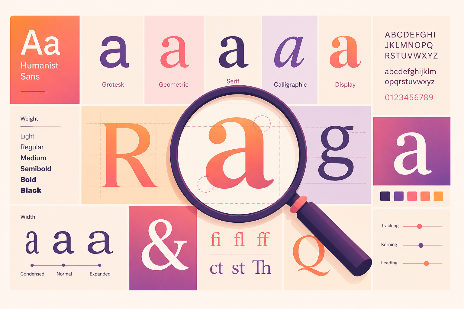
Most UMKM do not need three proprietary fonts. They do need a small, repeatable type system. One display treatment for headlines, one readable text font for long explanations, and one clear rule for prices or product specifications is often enough. The point is consistency, not novelty. If a business uses a playful handwritten logo, a restrained sans-serif for product details can make the overall identity easier to scan. If every surface uses decorative lettering, the brand becomes tiring before it becomes memorable.
This is also where a website becomes valuable. An Instagram profile gives a business a narrow set of type and layout controls. Its own website can carry the full system: logo, headline hierarchy, product descriptions, FAQs, trust signals, navigation, and calls to action. A social profile can introduce a person to the brand. A website lets the brand explain itself without being squeezed into a platform template.
💬 Why “Instagzam” travelled so quickly
The mockery focused on a practical issue: readers thought a letter could be mistaken for another letter. TechCrunch, Mashable, Creative Boom, Hypebeast, and Global Village Space all recorded variations of the same joke. That repetition does not establish that the logo is objectively illegible. It does show that a specific visual reading became a shared social shorthand.
A logo can survive disagreement. It has a harder time surviving uncertainty about what it says. At large sizes, a quirky letter may feel distinctive. At the width of a phone header or a social profile, the same flourish can become a problem. This is why a logo should never be approved only from a large artboard. It must be tested in the situations where a customer will actually meet it.
For a small business, run the test in reverse order of glamour. Start with the least flattering applications: a 32-pixel browser tab, a circular Instagram avatar, a WhatsApp Business profile, a receipt header, a low-quality photocopy, and a marketplace listing beside competitors. Then test the shop sign, packaging, pitch deck, and website hero. If the name is not readable in the cramped cases, an elegant presentation mockup will not save it.
There is a second lesson in the joke. People did not only comment on letterforms; they performed their reaction publicly. A visual change now has a social afterlife. Customers may screenshot it, make memes, compare before-and-after versions, and infer motives. That does not make redesign impossible. It means businesses should prepare a simple, honest explanation before they publish the first changed asset.
📱 Your logo is a network of touchpoints
A common mistake is to treat a logo refresh as a file replacement. The new PNG goes to Instagram. The old image stays in Google Business Profile, on a menu PDF, in a marketplace storefront, on an invoice template, on an email signature, and in a browser favicon. A customer sees three identities in a single buying journey and wonders whether the business is legitimate.
Instagram’s own situation illustrates the challenge at a much larger scale. The wordmark is changing while the app icon remains the same and the broader system is set to roll out over time. That is a controlled transition, not a single switch. The company can stage it across product surfaces. A small business should do the same, at its own scale.
Make an inventory before launch. Include:
- Instagram, TikTok, Facebook, LinkedIn, and WhatsApp Business profiles.
- Website header, favicon, open-graph preview image, and email signature.
- Google Business Profile, maps listing, directory entries, and marketplace shops.
- Product labels, packaging, invoice templates, quotation documents, menus, and price lists.
- Signage, uniforms, presentation decks, printed brochures, and saved templates in Canva or another tool.
Then assign an owner and date to each change. This is not bureaucracy for its own sake. It stops a visual transition from becoming an accidental trust problem. A customer should encounter the new identity as one coherent change, not as a trail of old and new files.
🧪 Do the small tests before the public reveal
Large companies can run research programs. A local bakery, clinic, consultant, salon, or online store can still test responsibly. The test does not need to answer whether a logo is “beautiful.” That question usually produces polite, unreliable answers. It should answer whether the logo identifies the business quickly and communicates the intended level of personality.
Show the current and proposed mark, one at a time, to people who know the business and people who do not. Limit the view to a few seconds. Ask what name they read, what type of business they expect, and which version they would recognize again tomorrow. Ask the same questions on a phone, not only on a designer’s laptop. Record confusion without arguing against it.
Also test a practical customer task. Can a person find the right Instagram account after seeing a product package? Can they tell a genuine WhatsApp message from a fake one? Can they recognize a website tab after opening several competitors? A visual identity exists to support these actions. If it gets in the way, the project needs another round.
Do not ask a poll to decide every design detail. Design judgment still matters. But a small sample can reveal a basic failure early: a name that becomes unreadable, a color that vanishes against platform dark mode, a symbol that resembles another business, or a mark that looks generic at thumbnail size.
🛍️ Relevance for businesses that sell through Instagram
For many Indonesian UMKM, Instagram is not merely a marketing channel. It is a catalogue, social proof archive, customer-service doorway, and a path to WhatsApp or marketplace checkout. That makes the platform’s interface familiar territory for their customers. When Instagram changes how it looks, it can make business owners more aware of their own visual clutter.
The useful response is not to imitate Instagram’s new lettering. Copying a major platform’s visual move is usually a shortcut to a dated identity. The useful response is to check whether your brand can be recognized without the platform’s frame. If a post screenshot lost its Instagram interface, would a buyer still know who made it? If the business name were removed from a product image, would the colors, type, photography, and tone still point back to the same shop?

A small business with limited resources should prioritize the parts customers use to decide and buy: a clear profile image, recognizable product photography, a readable name, an accurate bio, pinned highlights or links, a fast website or catalogue page, and a response process for inquiries. A new logo cannot compensate for an unclear price, missing product information, slow page, or a link that sends people nowhere.
That sequence matters. Branding is a service system as well as a visual system. The aesthetic layer works best when the customer journey already makes sense.
🧱 Separate a refresh from a rebrand
The words “refresh” and “rebrand” are often used interchangeably, but they describe different levels of change. A refresh preserves the basic identity while improving how it is drawn, organized, or applied. A rebrand changes more fundamental signals: name, positioning, audience, voice, offer, or visual direction.
Instagram’s August move is best described as a refresh based on the reporting available. The company retained its name, kept the gradient camera app icon, and preserved a script reference in the wordmark. It changed the expression, not the underlying identity. That is why the public could make an immediate before-and-after comparison.
For a small business, a refresh may be appropriate when the business is still recognizably the same but its materials are inconsistent or difficult to use. A rebrand may be needed when the name has legal conflict, the offer has changed substantially, the old identity excludes the intended customer, or the business has outgrown an amateur presentation that damages trust.
The distinction affects cost and communication. A refresh can often be introduced with a brief note: “Same business, clearer identity.” A rebrand needs more explanation: why the name, offer, or customer promise changed; what remains the same; and what customers should do next. Treating a rebrand as a cosmetic update creates confusion. Treating a small refresh as a grand reinvention can create unnecessary anxiety.
🧾 Build an identity system you can actually maintain
The best visual identity is not the one with the most assets. It is the one a small team can apply correctly on a busy Tuesday. An exhaustive brand book that nobody opens has less value than a two-page set of rules that a staff member can follow while making a product post.
Start with a practical minimum:
- A primary logo and a compact version for small spaces.
- A black-and-white fallback, plus rules for light and dark backgrounds.
- Two or three approved colors with accessible contrast for text.
- One heading style and one body-text style.
- A small folder of reusable post templates and product-photo treatments.
- Clear guidance on tone: formal, warm, playful, direct, or technical.
- One central folder containing the current files, not five slightly different logo exports in personal chats.
The last point is mundane and crucial. Many inconsistent brands are not inconsistent because the owner lacks taste. They are inconsistent because people cannot find the right file. Make the current version easy to locate, name it clearly, and archive the old version rather than leaving it in active folders.
A website can serve as the reference point. Its header and pages can show the current logo, color, typography, service descriptions, and contact route in one stable place. Social platforms change interface rules. A website gives a brand a home it controls.
⚖️ Do not confuse a loud reaction with a failed redesign
The “Instagzam” response is evidence of attention. It is not, by itself, a verdict on whether Instagram’s refresh will work. Public reaction to familiar logos tends to skew immediate and emotional because people recognize the old version before they have time to learn the new one. Some criticism identifies real usability issues. Some is simply the pleasure of reacting to change together.
A business should take criticism seriously without letting the fastest comment section dictate every decision. Look for patterns. Are people unable to read the name? Are returning customers asking whether the business is different? Are customer-service inquiries rising because a new link or profile image creates uncertainty? Those are operational signals. A meme without customer confusion may be a temporary cultural moment.
The same principle applies inside the business. The owner who loves the new logo and the employee who hates it are both data points, not final judges. Return to the criteria set before work began: recognizability, readability, differentiation, fit with the offer, technical performance, and ability to apply it consistently.
🧰 A lower-risk rollout for an UMKM
A careful rollout is slower than uploading one new profile picture, but it reduces waste. First, finish the system: final files, color rules, website components, social templates, and a touchpoint list. Second, update the owned channels where customers expect accurate information, especially website, Google Business Profile, WhatsApp Business, and primary social accounts. Third, use a short announcement that explains the change in plain language.
Avoid an over-written manifesto. “We have updated our visual identity so it is easier to recognize across our website and social channels. Our products, team, and contact details remain the same” may be enough for a refresh. If there is a bigger business change, say exactly what it is.
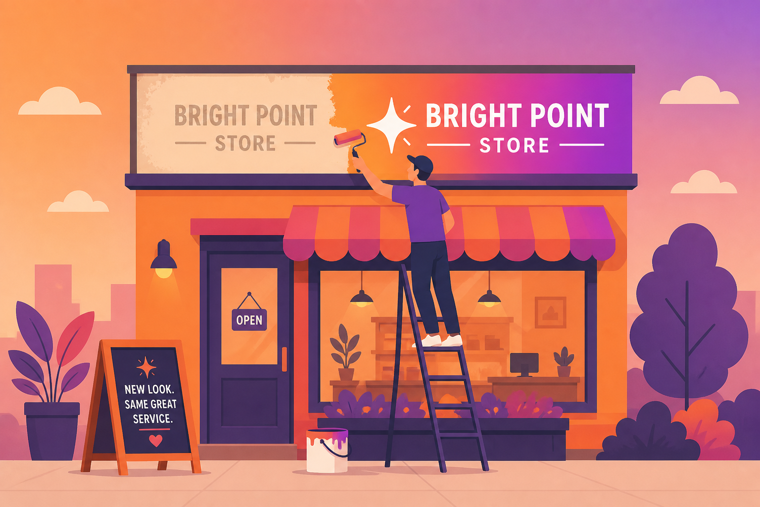
Keep the old mark available internally for a transition period, clearly labelled as retired. If physical packaging or signage cannot change immediately, do not pretend it has. Tell customers that the old and new marks both belong to the same business while stock is used up. Honest transition messaging is more credible than forced visual perfection.
Finally, measure the things a refresh is supposed to help. Website direct visits, branded search, profile visits, saved contacts, message-start rate, account impersonation reports, and customer feedback can be more useful than raw likes on a launch post. If the aim was recognition, check recognition. If the aim was a cleaner multi-channel system, audit whether every channel now uses it.
🧠 The durable lesson is restraint
Instagram did not throw away every familiar element. According to the five August 13-14 reports cited here, it kept the camera icon, retained a script relationship, and presented the new wordmark as part of a staged system rollout. Whether every letter proves popular is a separate question. The structure of the decision is still instructive: preserve recognition, revise a specific component, and build a system around it.
That is a better starting point for a small business than “we need a new logo because the old one feels boring.” Begin with the customer’s experience. What do they recognize? Where do they hesitate? Which inconsistency costs trust or time? What must stay familiar while the business gets clearer?
A rebrand is not a content event. It is an operational change that customers can see. Instagram’s “Instagzam” moment shows why the smallest curve can become public conversation. For an UMKM, the practical goal is simpler: make the next version easier to find, easier to read, and easier to trust than the last.
Sources: TechCrunch (13 August 2026); Mashable (13 August 2026); Creative Boom (14 August 2026); Hypebeast (August 2026); Global Village Space (August 2026). All five reports cover Instagram’s wordmark refresh and public response. Analysis and small-business recommendations are Eline’s editorial assessment.